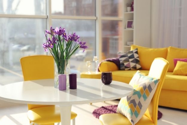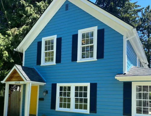
Color can have a unique effect on our mood. It can make us happy, angry, or conjure up feelings of indifference. A home should reflect its owner—not just in terms of emotion, but style. Making use of color theory can help you transform your home into a comfortable, eye-catching space that can make you feel energized, happy, confident, or anywhere in-between.
To make use of this helpful tool, you’ll need to understand the basics of color theory in interior design.
What Are the Basic Colors?
The principles of color theory date back to the 15th century, but the color wheel wasn’t invented until 1686, by the renowned mathematician Isaac Newton. Breaking down the color wheel into these three, distinctive sections can help you select and match different shades.
Primary
These can’t be created by mixing other colors. The three primary colors include red, blue, and yellow.
Secondary
These are made by mixing two of three primary colors together. The three secondary colors include orange, purple, and green.
Tertiary
These are made from mixing primary and secondary shades together. When it comes to tertiary colors, there are endless possibilities.
Find a Harmony
By studying the relationship between hues on the color wheel, you can create interesting pairs or combinations. These are commonly referred to as harmonies. There are six popular types of harmonies.
Monochromatic
Refers to different values of a singular color.
Analogous
Refers to a small group of colors that neighbor each other on the wheel.
Complementary
Refers to two colors that sit directly opposite from each other.
Split-Complementary
Refers to a pairing of three, with one primary color that’s used with the two analogous colors to its complement.
Triadic
Refers to three colors that are equidistant, or an equal space away from each other.
Tetradic
Refers to two different sets of complementary colors.
Adjusting the Temperature
You can organize colors into one of two temperatures, or tones. In order to fully understand the basics of color theory in interior design, you’ll need to know the difference between warm colors and cool colors.
Warm
Warm colors might remind you of bright, vibrant things, like sunshine, or the relaxing shades of autumn. The three warm colors are red, orange, and yellow.
Cool
Cool colors might remind you of the ocean and sky, or playing outside in the freezing, late-season cold. The three cool colors are green, blue, and magenta.
You can choose either a warm or cool palette to focus your design on. A warm palette might involve colors like peach and ivory, while a cool palette can consist of a light blue and medium-toned gray. Temperatures can have a spatial effect on a space. Warmer tones will make your home feel comfortable and compact, while cooler shades can make a space feel more spacious.
The Meaning of Colors
People often associate different colors with different characteristics from emotions. For example, red is seen as a bold, powerful color, while yellow is considered sunny and optimistic. You can select your color palette based off the kind of feeling you want a room to invoke. Incorporating different colors can have a heavy impact on your mood. If you’re repainting your office, try going with an energizing green or ambitious red. For your bedroom, you might want to rely on a tranquil shade, like blue.
If you need help with interior painting in Portland, Oregon, look no further than JK Paint & Contracting. Whether you need help coming up with the perfect palette or want a trustworthy reliable professional to help you paint, we’re here to help.


